3 "hacks" to build amazing engineering presentations
One of the most interesting thing I've seen recently is this slide from an Andrej Karpathy (ex Tesla's AI Head) presentation where he explains his hydranet:

Although the content is amazing, the form isn't. Because the presenter is so great, it probably wasn't a problem for him.
But really, unless you're Andrej Karpathy, nobody's going to read your slides if they look like this.
Now, what if this slide looked like that:
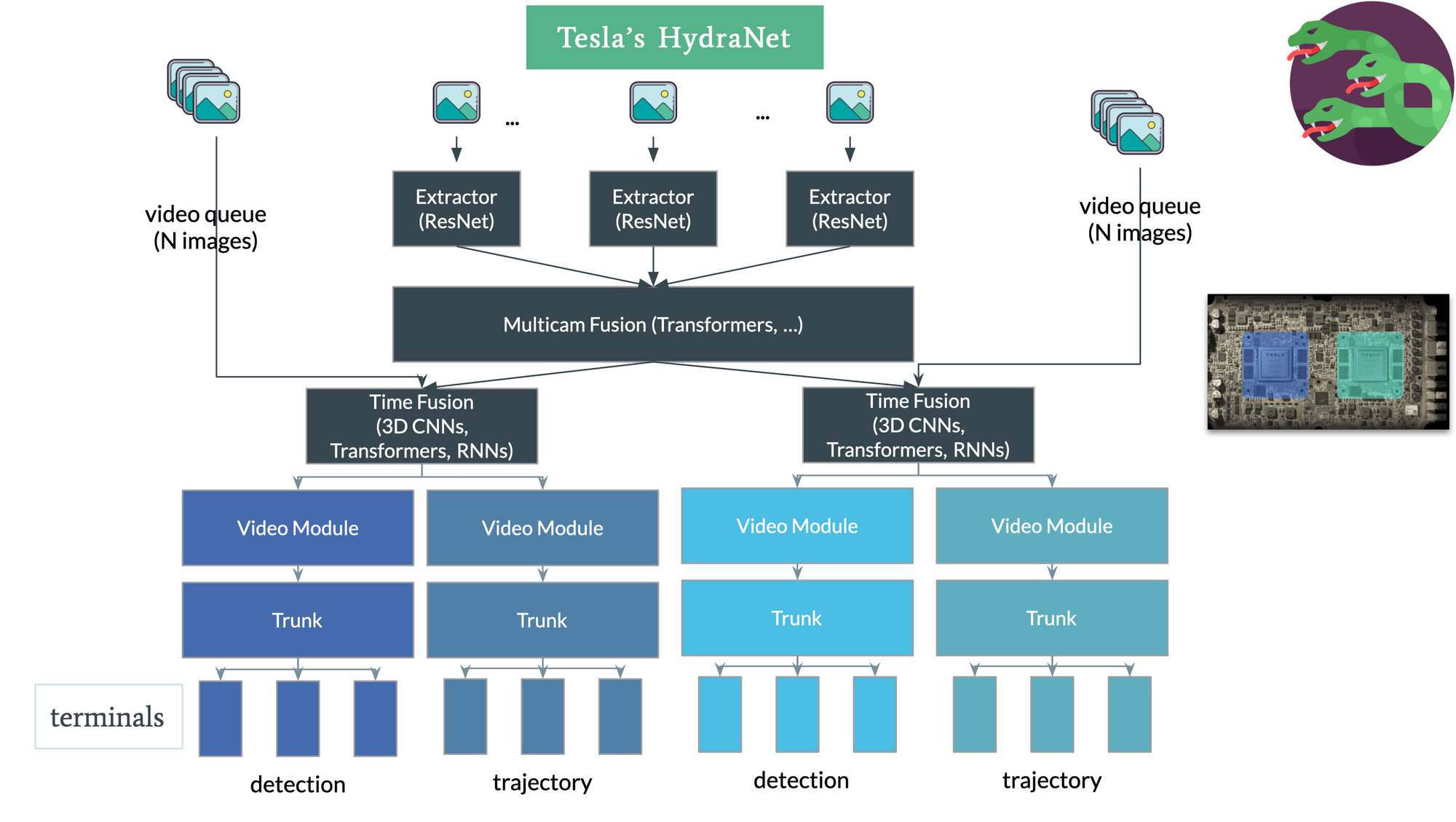
It gets more attention, doesn't it? It produces more clarity, a better catch, and ultimately gives better results. In fact, this image has been stolen by other engineers explaining hydranets over 100 times!
During your career, you're gonna need to create powerpoint presentations 100s of times. Whether it's to talk about an architecture, to teach a concept, or simply to explain what you've been working on during the week...
You can't afford to present ugly slides, and be seen as a boring and unattractive person (hey, I'm just saying).
People think with images, and they use images to memorize and understand things.
But if you learn how to create good looking presentations, you will be 100x more memorable than any of your colleagues.
So, today, I'm going to share 3 tips that you can apply right away to make your presentations stand out.
Starting with icons.
1. Icons 🚀
Back in my consulting years, I was creating a powerpoint presentation to introduce Machine Learning to the Committee of the Bank of France.
I was scared af.
About a week before going there, a colleague named Alexis viewed my powerpoint.
"It's ugly." He said.
He was right, the powerpoint was terrible... but I has no idea how to make it look good.
So, he shared one website with me: Flaticon.
There, you're going to find lots of icons you can use in your presentations. Immediately, it's going to stand out. Some are paid, others are free, and others require attribution.
This is good enough to make your presentations already 10x better!
But beware of consistency:
Some icons are circled, others aren't, some have specific fonts, others have another.
You want to make sure you're being very consistent with your icons.
An example:
When I built my 4 Pillars of Autonomous Driving image, the "Planning" icon didn't have a circle, so I had to build one on top of it.

You don't realize this, but people HATE inconsistency. Look at the second image again and tell me nothing bothers you just a little bit?
If you're gonna have circles, be sure not to miss a single one of them. If your icons have gradients, make all of them use gradients. (not like the ✅ and ❌ I just used)
2. Colors & Contrast 🛡
It's always better to use colors, and a good practice is to use just a few of them. 2 or 3 maximum. No need to use a whole rainbow.
If you go to the website ColorSpace, you're going to get recommendations for matching colors.
But then comes contrast:
Contrast is very important in a website or presentation. You want your colours to look good and stand out.
But according to an instagram post I found, 58% of adults in the US have eye strain from working on computers.
For example, if you contrast black and white:
- Black is (0,0,0)
- White is (255, 255, 255) or (1,1,1)
Well, these colours aren't great together, because this is too much contrast.
What you might want is to use dark gray, midnight blue, etc instead.

So, use contrasts, but beware of eye strain. Don't go black and white.
Finally, let's see how to make the entire thing funnier and easier to get.
3. Images & Games 🤡
I've become a natural when it comes to writing and vulgarizing technical content using words. I could write 5,000+ words about any topic.
Good, but I found it much better to visually sh*t the f up during presentations and use minimal wording.
Something Apple style, with just one or two keywords, and that it's it.
A couple of months ago, as I was releasing my course on Neural Optimization, I wanted some concepts to be a little more interesting than the usual stuff.
And I had a concept to explain called Model Pruning.
Model Pruning is about removing useless connections in a neural network to make the model lighter. For example, weights like 0.00024 should be removed because they don't impact the network but still take some memory.
The concept I wanted to explain was the difference between Local and Global pruning.
- Local Pruning is when you prune (remove) a percentage of every single layer.
- Global pruning is when you prune (remove) a percentage globally.
So look at the graph on the left and right, and tell me which one works better:

But also notice how I created a game asking the viewer: "Guess which one is local pruning and which one is global pruning?" (in the image, the solution is showed already)
Games help with attention and memorizing.
You want to use games whenever you see an opportunity.That's all I have for today. So think about games, think about ways to make it a bit funnier, and let's rock these presentations!
Here are 3 things we discussed:
- Use Icons
- Use Colors & Contrast, but beware of eye-strain
- Use Games
Good luck with whatever presentation you have. I'm sharing more tips for aspiring self-driving car and computer vision engineers in my daily emails, you can subscribe here.